Big-time ‘Mad Men’ put an art-centric stamp on MSU’s Wharton Center
How do you rediscover your soul? If you’re MSU’s Wharton Center for the Performing Arts, you look inside yourself — literally.
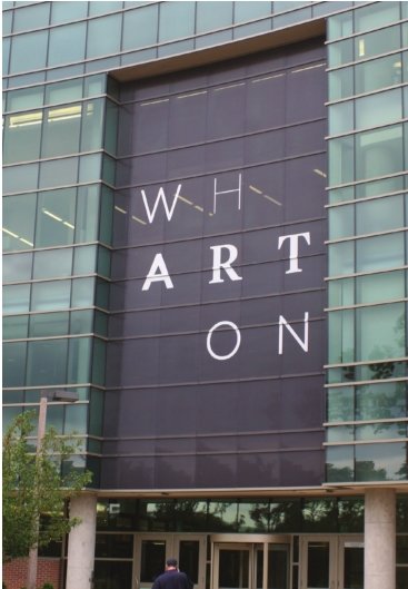
In the Wharton Center’s new logo, the word “art” floats like a guiding spirit out of an airy matrix of letters spelling “Wharton.”
The elegant logo is already in place on the building and is destined for ubiquity in ads, brochures, donor pitches and merchandise.
The logo’s birth story is a world-class “Mad Men” drama, non-profit style, involving months of work, a giddy “ah-ha” moment and a walk-on role for the Whartons themselves.
For years, Wharton Center director Michael Brand has longed for a logo that would look at home on a bus stop or billboard in New York, L.A. or any major cultural center, but couldn’t afford the price tag for a full-on branding overhaul.
Brand found that audiences and potential donors had “wildly disparate” ideas of what the Wharton Center was all about.
Focus groups and interviews showed that many people, including MSU students, think of Wharton primarily as a purveyor of Broadway pizzazz and don’t know that it’s a nonprofit arts hub that hosts world-class performers in music, drama and dance and educational programs with statewide reach.
Thanks to pro bono work by a global consultancy with Spartan connections, he got his wish, and much more.
Two years ago, MSU alumnus Eloy Trevino, then working at the global Prophet consultancy, visited East Lansing for a football game and met with Wharton staffers.
Prophet has a blue-chip portfolio, with clients like NBC Universal, Gatorade, Marriott, General Motors, Crate & Barrel, BP and Volkswagen.
“We couldn’t afford them in a million years,” Brand said.
But when Brand asked Trevino for advice on taking Wharton’s branding to the next level, Trevino went one better. Prophet lets its employees do “passion projects” on their own time, mostly nights and weekends, using the firm’s resources, in a program called “Prophet for Non-Profit.” The Greater Chicago Food Depository is among several nonprofits that have benefited from the program.
Brand said a major project like the Wharton rebranding would have cost $600,000 to $1 million. When Trevino took the idea back to Prophet’s Chicago office, creative director Andres Nicholls, a branding wizard with an international reputation, eagerly got on board and a team started to come together.
Between big accounts for the likes of Colgate, Green Mountain Coffee, Visa and Cartier, the team burned midnight oil for six months, firing emails back and forth, conducting market research, focus groups and interviews with donors and everyday folks.
“We wanted it to be a real project, not a pet project,” Trevino said. Work started last summer and ended in March.
One day Trevino checked in at the New York office, where Nicholls and New York designers Joseph Maruca, Dani Kim and Baron Santiago were waiting with smiles on their faces.
“You’ve got to see this,” Nicholls told Trevino, dragging him down the hall.
Among 40 proposed sketches was a colored pencil sketch of the word “Wharton” with the “art” in a different color.
Ding. “We all just stared at it,” he said. “You couldn’t get it out of your mind. I thought, ‘How did none of us see that before.”
There were refinements later, including a flexible cube format and various fonts suggesting a diversity of performances and perspectives, the “art” theme popped and stayed there.
“It was my favorite from the beginning,” Trevino said.
The Wharton team wanted to exude elegant sophistication and down-to-earth accessibility all at once — a tall order. But reconciling seeming opposites is the kind of challenge the big branding agencies live for.
“We heard from focus groups that the Wharton Center is where the fancy people go,” Trevino said. “I grew up in Lansing, and it’s a blue-collar town, and the Wharton Center needs to be accessible to everyone.”
The new logo’s spare elegance is offset by a building-block playfulness, with letters in different typefaces that stack in various ways. Some versions use bright colors; others are cast in classy black and white.
“There’s no reason why the Wharton Center can’t be held in the same light as the Lincoln Center, the Met and other wonderful performing arts centers we have,” Trevino said.
The team kept coming back to a quote from former MSU President Clifton Wharton, prominently featured in a new brochure: “Performance art is a beautiful window through which to view humanity.”
“That is the role we’re playing,” Trevino said. “We’re not selling ‘Lion King’ tickets.”
Response so far has been unanimously favorable among Wharton staff, performing arts partners and big donors.
If it sells more tickets, so much the better. Even the Disney juggernaut, notoriously controlling and litigious over its properties, is letting Wharton float the letters into a promotional image from “The Lion King,” artfully positioned so that the “H” hugs Lion King Mufasa’s left bicep.
Brand said the result is “all we hoped for and more.”
The topper came when the building’s namesakes, Clifton Wharton and his wife, Dolores Wharton, enthusiastically endorsed the branding package.
“They didn’t even realize ‘art’ was in their name,” Trevino said.


Support City Pulse - Donate Today!
Comments
No comments on this item Please log in to comment by clicking here